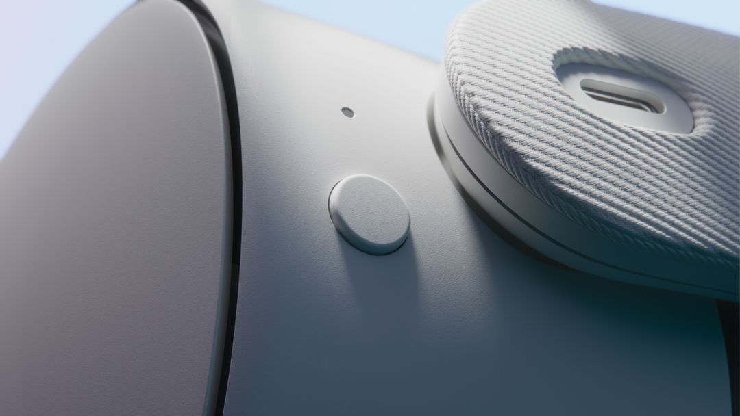
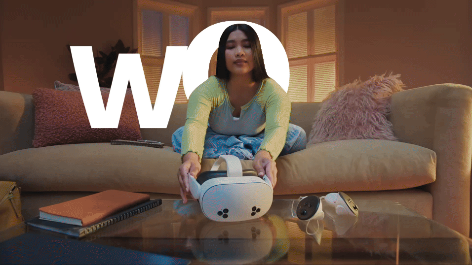
Meta Quest 3S
Launch Film
︎ Role: Art Direction / Design
︎ Year: 2024
︎ Produced at The Mill
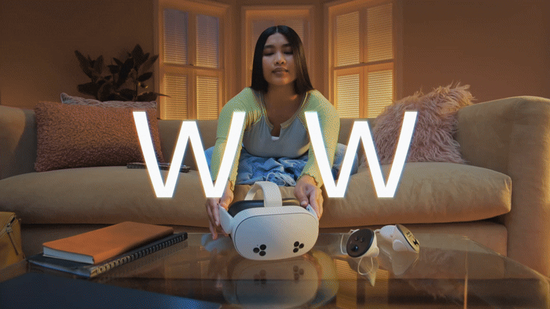
One of my recent projects at The Mill: a high-energy product launch film for the Meta Quest 3S! We blended live-action shots with sleek product renders and playful type animations, creating a dynamic showcase that feels as lively as the product itself.
The challenge was striking a balance between fun and clarity—keeping it playful and unexpected, while staying true to the brand. It was a fun challenge to design for, and I loved the creative push it gave me!
The challenge was striking a balance between fun and clarity—keeping it playful and unexpected, while staying true to the brand. It was a fun challenge to design for, and I loved the creative push it gave me!
⏤
The Headset
︎︎︎ Product
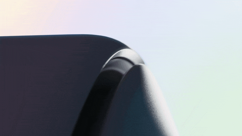
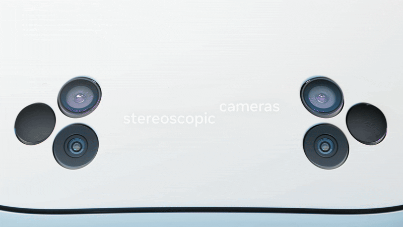
In the intro, we wanted to tease the Meta Quest 3S—like a slow reveal, drawing you in before giving it all away. We played with light and shadow, letting those shapes and details peek through in just the right way to keep you guessing.
We also got creative with the angles, choosing visually intriguing crop shots of the headset to keep the tension high and the curiosity flowing. It was all about keeping the suspense while letting the product shine.


⏤
Type Motion System
Creating the type motion language for this campaign was both a fun challenge and a huge learning moment. We dove into a range of ideas to make typography feel as dynamic as the visuals—experimenting with motion, scale, and interaction to seamlessly complement the live-action shots and 3D renders.
With so many moving pieces, from live-action footage to 3D renders to effects, we needed a strong framework to keep the type feeling cohesive. I helped develop a set of motion principles that made sure the type was always intentional, polished, and never took away from the story.
The aim? To find a balance between bold, energetic typography and clean, structured design—amplifying the campaign’s playful, immersive vibe without overwhelming the viewer. We wanted it to be vibrant and fun, and tie everything together in a way that felt fresh and exciting for a younger audience.
︎︎︎Final key moments


︎︎︎Early Explorations
We kicked things off by exploring a variety of directions before settling on the final look. While these early concepts didn’t make it into the final cut, they played a key role in shaping the design and pushing the creative boundaries. Here are a few of the initial designs that helped guide the way.


︎︎︎
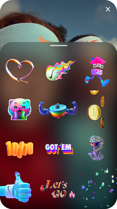
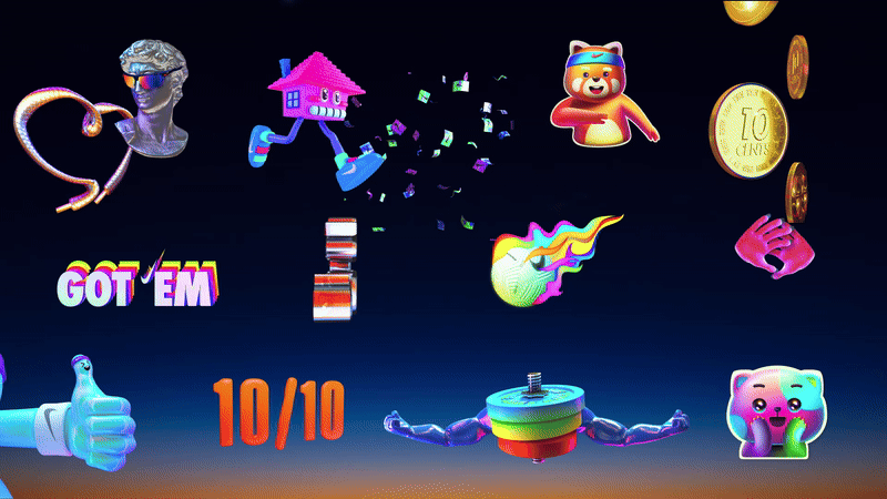
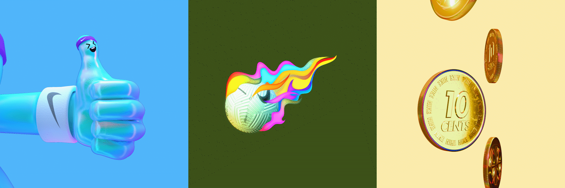
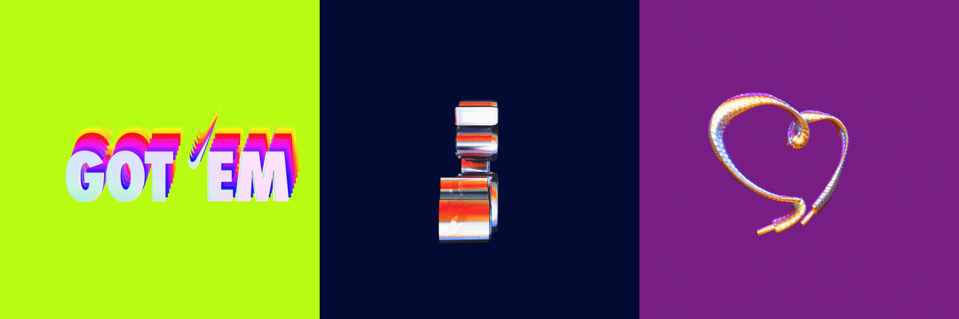
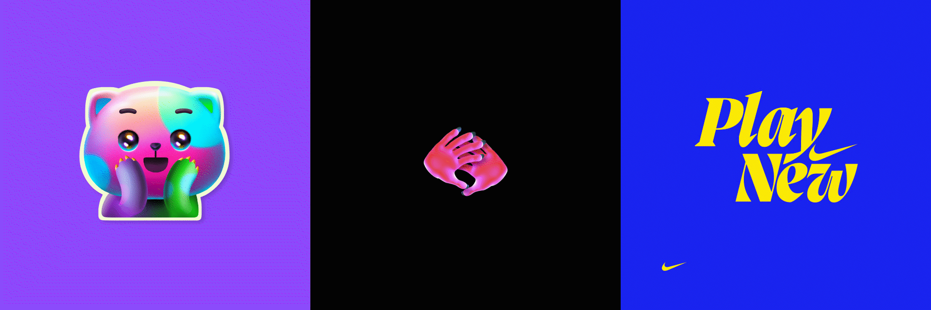
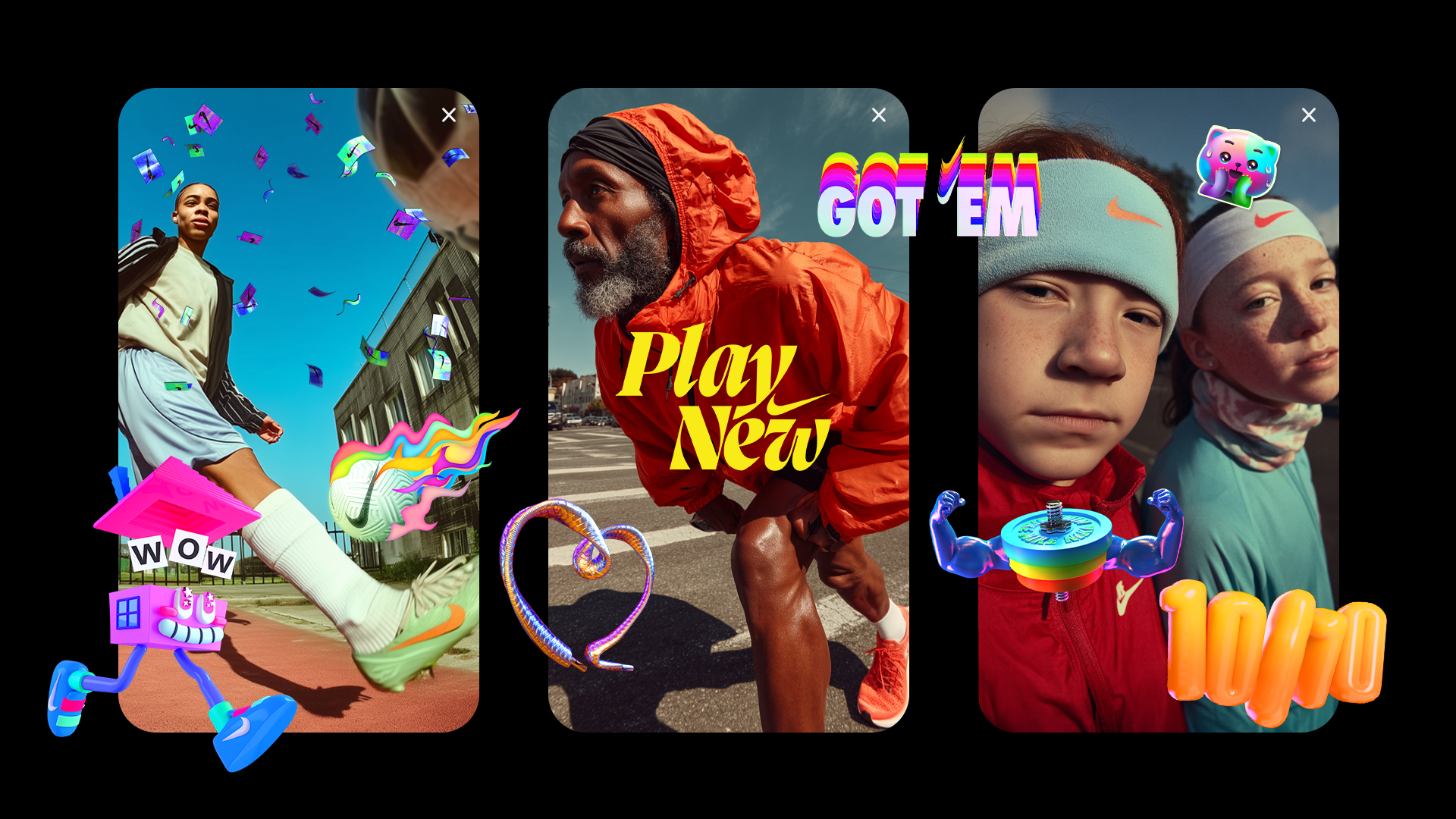
This one was pure fun. Our goal was to turn Olympic energy into tiny, expressive loops. Nike asked us to create a set of animated GIPHY stickers for the Play New campaign—something sporty, playful, and Gen Z–friendly.
I designed a series of motion stickers that were loud, cheeky, and made to move—built for sharing during the Olympics, or anytime sports emotions run high.
⏤
Process
︎︎︎ Idea Exploration
We began with freeform sketching—exploring symbols, gestures, and moments that could speak sports without saying much at all.
The focus was on evoking feeling: excitement, frustration, joy, fandom. From clever metaphors to visual gags, we explored a range of ideas before refining them into six thematic directions.


I explored a mix of 2D and 3D treatments, choosing the medium that best brought each concept to life. To create a cohesive feel across the pack, I blended textures between the two—giving 2D stickers a bit of dimensionality, and treating 3D ones with graphic accents to connect them back to the set.
While each sticker had its own personality, we aligned around one core goal: to make everything feel bold, vibrant, and full of playful energy.


Apple Music
Summer + New Life
︎Role: Design Lead / Art Direction
︎ Produced at Scholar
Summer + New Life
︎Role: Design Lead / Art Direction
︎ Produced at Scholar
︎︎︎ 01 Summer
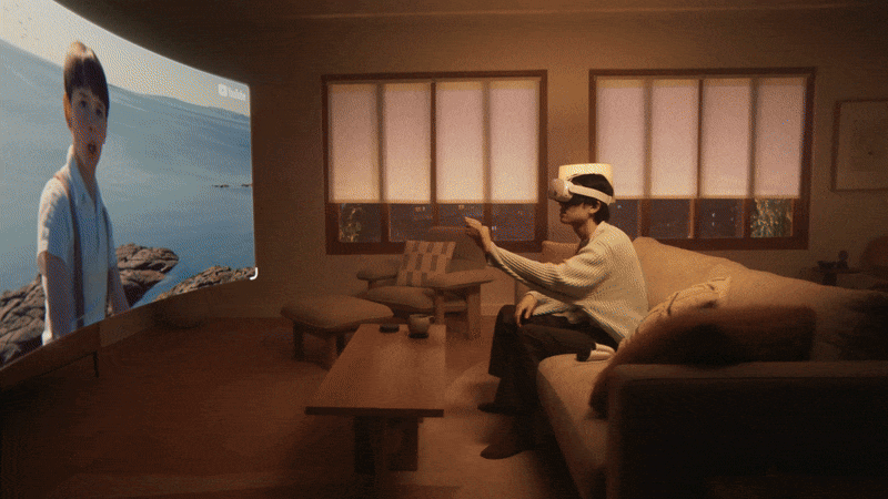
This campaign is all about capturing the spirit of summer in two unique journeys, each bursting with energy, rhythm, and fun. With Apple Music as the soundtrack, we set out to create a bold and vibrant visual experience.
“Summer,” we follow the transformation of a protagonist from student life into young adulthood. This metamorphosis is brought to life with fluid cel animation and a vibrant, evolving color palette, giving her journey an electric feel and making her next stage of life feel like one big summer hit.
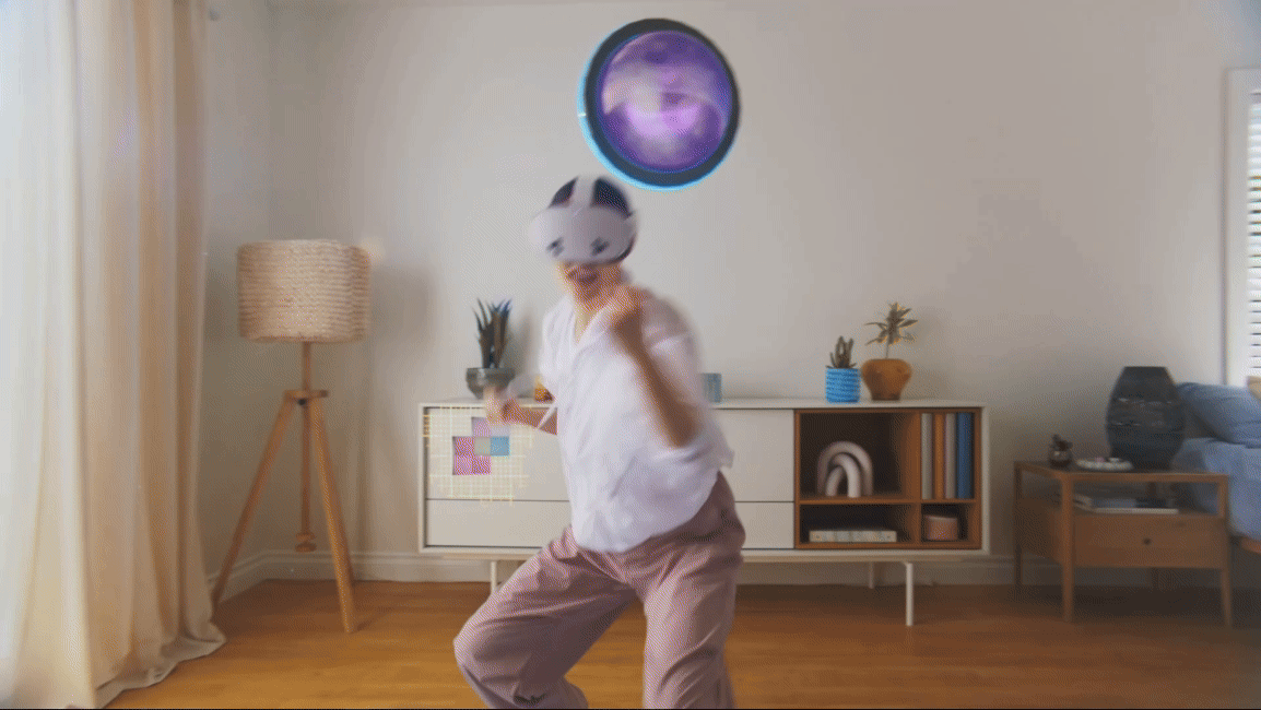
︎︎︎ 02 New Life
“New Life” takes us to the heart of Japan’s festival season, where our character is having the time of his life—diving, crowd-surfing, and vibing through the colorful chaos of the festival scene. It’s a high-energy ride that captures the very spirit of summer.
⏤
Early Explorations
When I first got the brief, I was beyond excited— this was a designer’s dream! With no limits, I had the freedom to go bold and dynamic. My goal was to capture the emotions and transformative moments we feel when we listen to music. I quickly created a series of design frames that brought those feelings to life with energy and movement. These frames were key in winning the pitch, laying the foundation for everything that followed.


⏤
Character Design
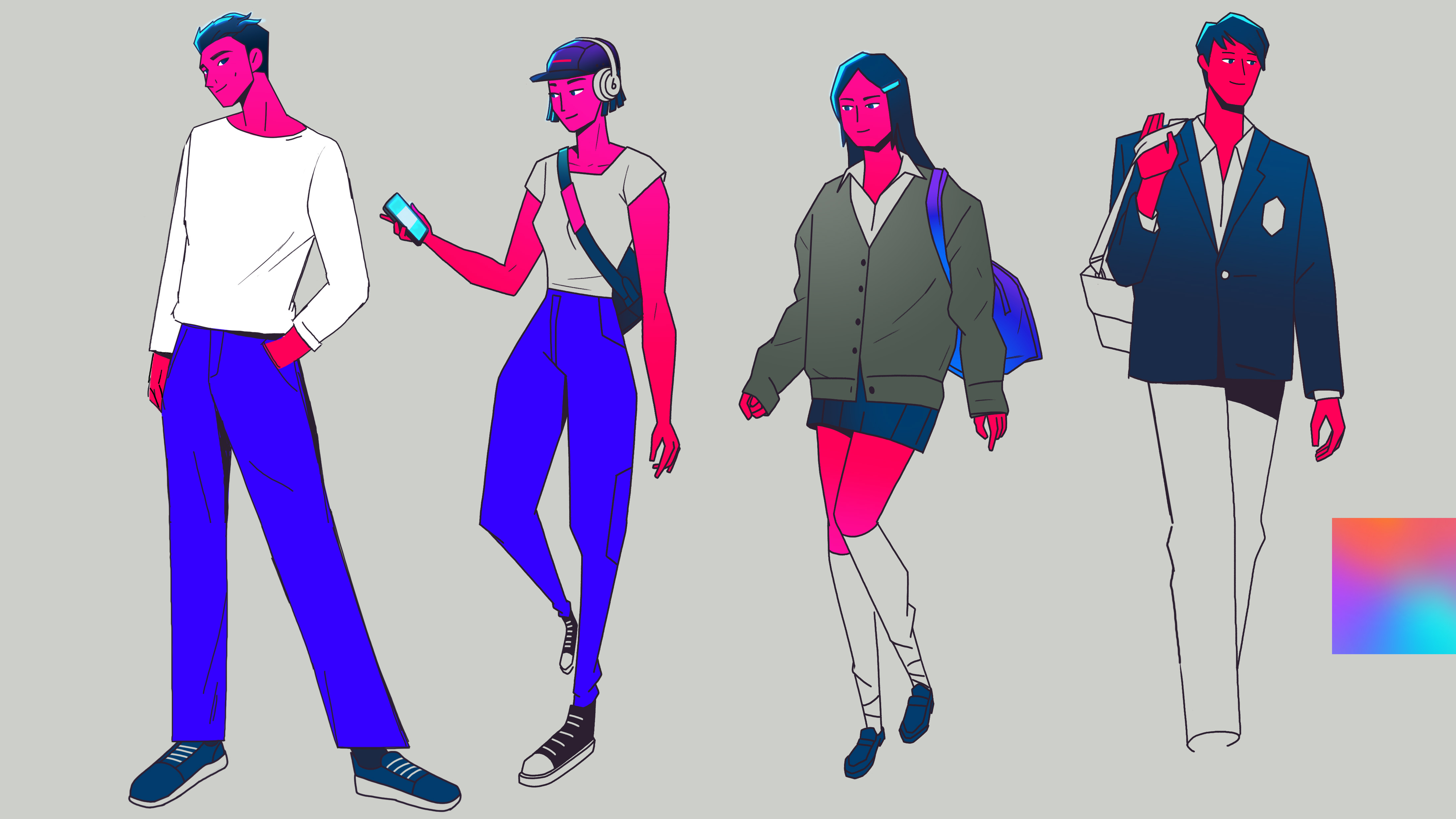
For the character design, I wanted to strike a balance between edgy and sophisticated, giving the characters a cool, elevated look that felt authentic yet aspirational. I focused on designing characters in their 10s to 20s, inspired by street fashion to create a connection with the Apple Music audience. The goal was to make the characters feel relatable yet stylish, embodying the energy and spirit of today’s youth culture.

⏤
Final Design Frames
These frames showcase the energy and emotion we wanted to bring to life through the Apple Music campaign. We explored the transformative moments music creates in our lives, using vibrant colors and dynamic movement to reflect that. From festivals to personal transitions, these final designs amplify the project’s core message: music has the power to shape and energize our experiences.


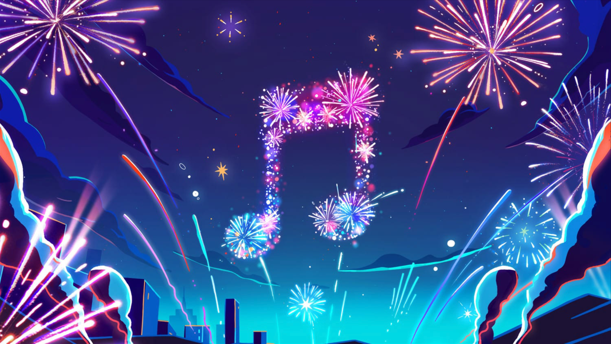
And of course, we had to end with a bang—fireworks in the shape of the Apple Music logo, lighting up the night like the perfect festival finale.

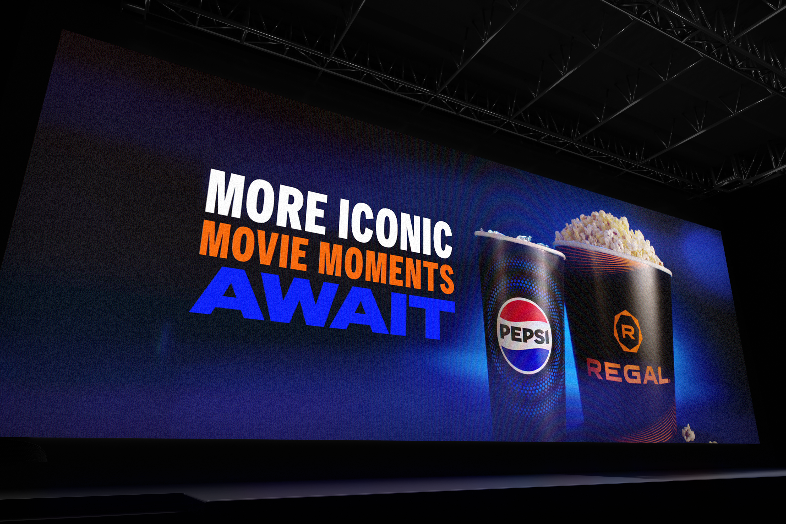
Pepsi X Regal
Unforgettable Quotes
︎ Role: Art Direction/Design
︎ Year: 2023
︎ Produced at The Mill
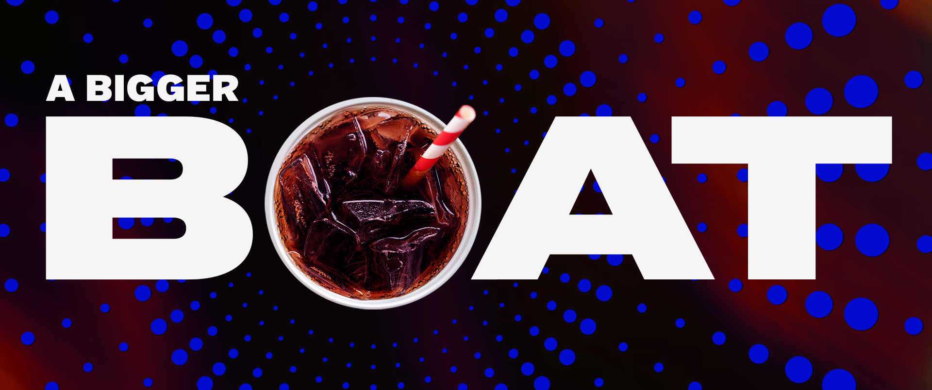
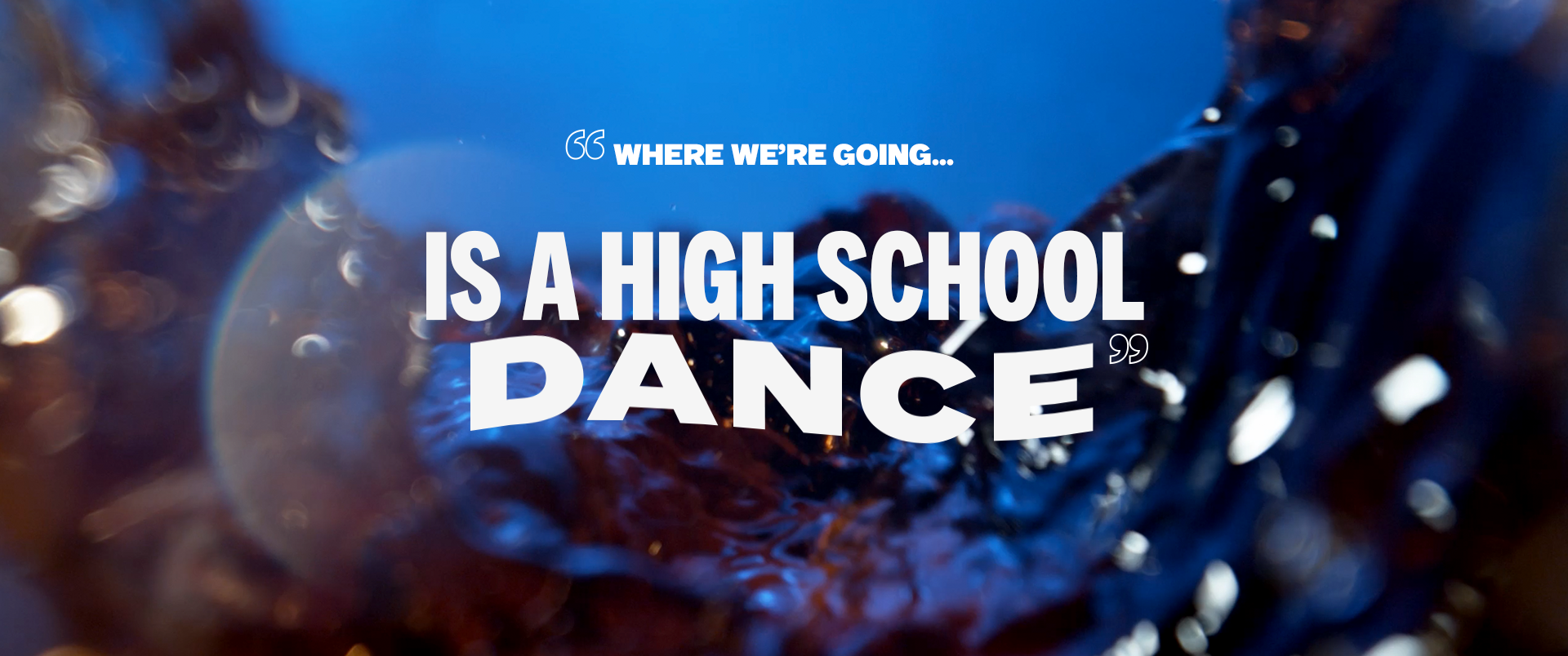
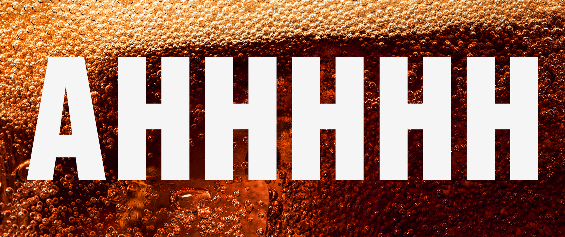
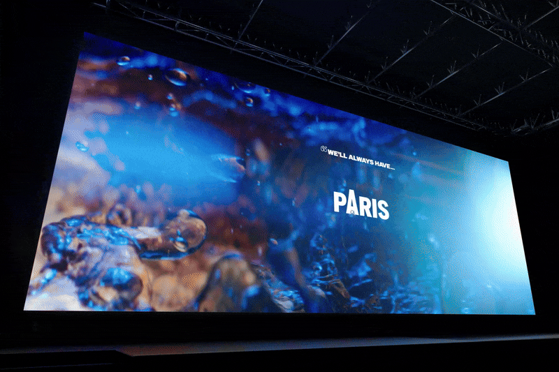
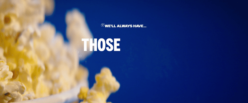
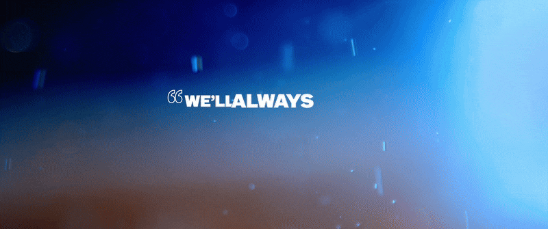
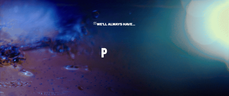
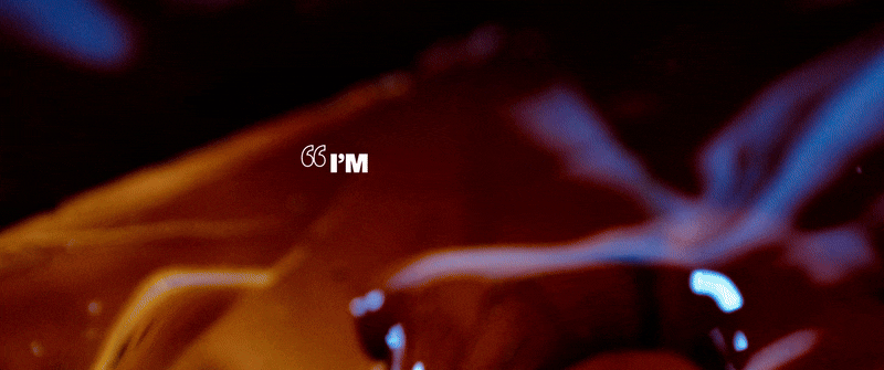
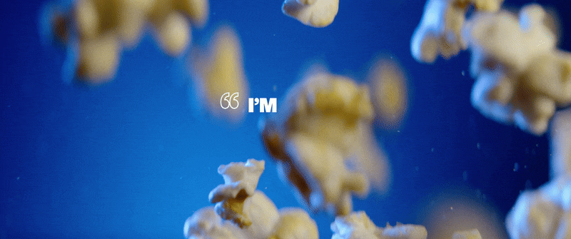
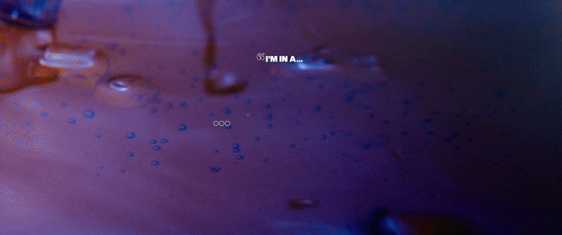
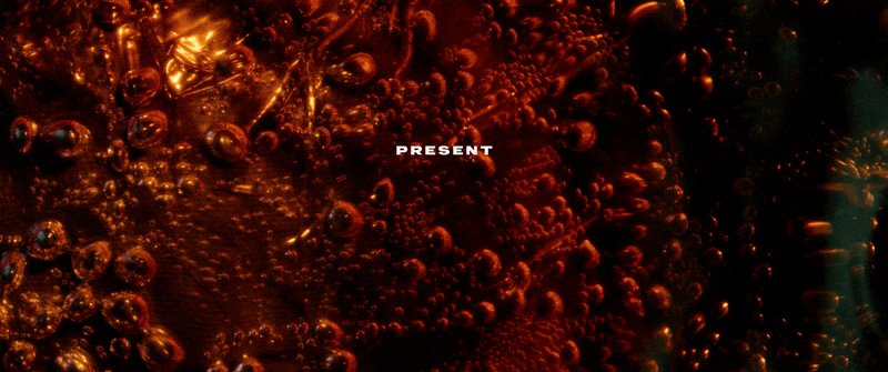
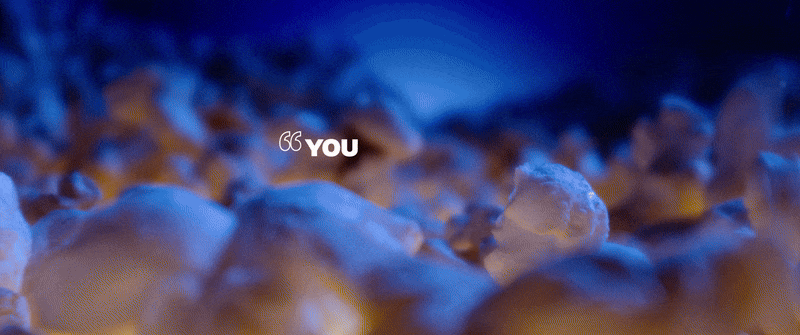
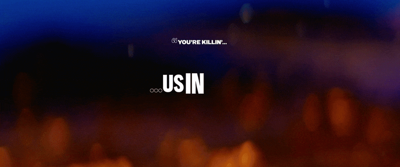
Pepsi and Regal teamed up to create a fun, engaging pre-movie experience, blending live-action cinematography with kinetic typography. Crisp, close-up shots of Pepsi and popcorn—enhanced by dramatic lighting and motion—make every moment enticing. The typography plays out like an interactive trivia game, playfully shifting through variations of famous movie quotes before the final reveal. Designed to entertain and engage, this piece enhances the theater experience while seamlessly tying into the excitement of moviegoing—just in time to sip a soda and enjoy the show.

⏤
Developing
Type Animation
To bring the trivia game to life, we pushed the creative potential of Pepsi’s brand font while staying true to the brand guidelines. By mixing condensed, regular, and extended weights, we created dynamic movement, using shifts in weight to emphasize key words—guiding the eye like a sing-along karaoke. Some words fluidly expanded and contracted, keeping the animation bold and full of energy.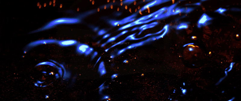
⏤
Visual Language
for the Big Screen
The rhythm of the animation was essential. We wanted the pacing to feel exciting and snappy while ensuring viewers had enough time to read each line and anticipate the next reveal. Striking the right rhythm kept the sequence engaging without feeling rushed.Balancing graphic elements with the Pepsi brand was another key challenge. We wanted to keep it dynamic while staying within brand guidelines, experimenting with imagery and motion to add a wow factor. Through rounds of refinement, we found the sweet spot between fun, high-energy motion and brand cohesion, keeping audiences captivated from start to finish.

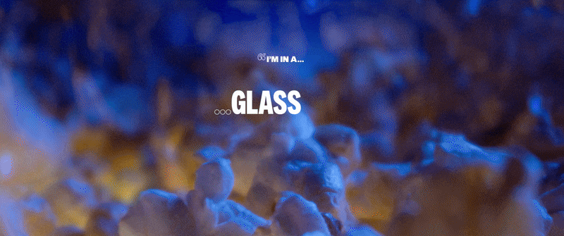
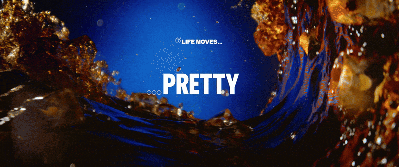
︎︎︎ The circular motif is a big element in Pepsi’s branding, often appearing as radiating rings or patterned dots. For this project, we adapted the motif into bold, thicker rings, allowing us to incorporate footage within them. During the final trivia reveal, these rings animate outward, celebrating the correct answer while dynamically framing it. The multiplied rings also serve as a mask, revealing textured footage of Pepsi or popcorn, adding depth and richness to the moment. This visual cue not only reinforced the branding but also made the final answer impossible to miss, ensuring a satisfying payoff for the audience.

⏤
Early Design Exploration
Before landing on the final design, we explored a range of visual approaches to bring energy and excitement to the piece. These initial pitch frames helped shape the direction, refining how typography, motion, and Pepsi’s brand elements came together. Here are some of the frames I created during the early design phase.