⏤
Designing for Facebook News was like getting to remix a classic track. The brief? Extend the Facebook brand in a bold, editorial way that still felt trustworthy and clean. I got to play in the space between modern digital design and the tactile, textured world of print—bringing in warmth, grit, and personality to balance out the platform’s clean foundation.

⏤
Process


︎︎︎Initial Design Approach
My initial frames explored a more analog visual language—texture-rich, slightly gritty, with visual cues pulled from classic editorial layouts. But to avoid feeling retro, we made a conscious shift toward a crisper, more modern design system—one that lets the content breathe and feels right for today’s news consumer.


︎︎︎Typography
Using Facebook’s brand font as the backbone, I focused on making the headlines crystal clear—no distractions, just clean, confident type. Every design element was there to support the message, not compete with it. Whether it was texture, color, or motion, the goal was always to amplify the clarity and intention of the words. News should speak loud and clear—and we made sure the type did just that.
⏤
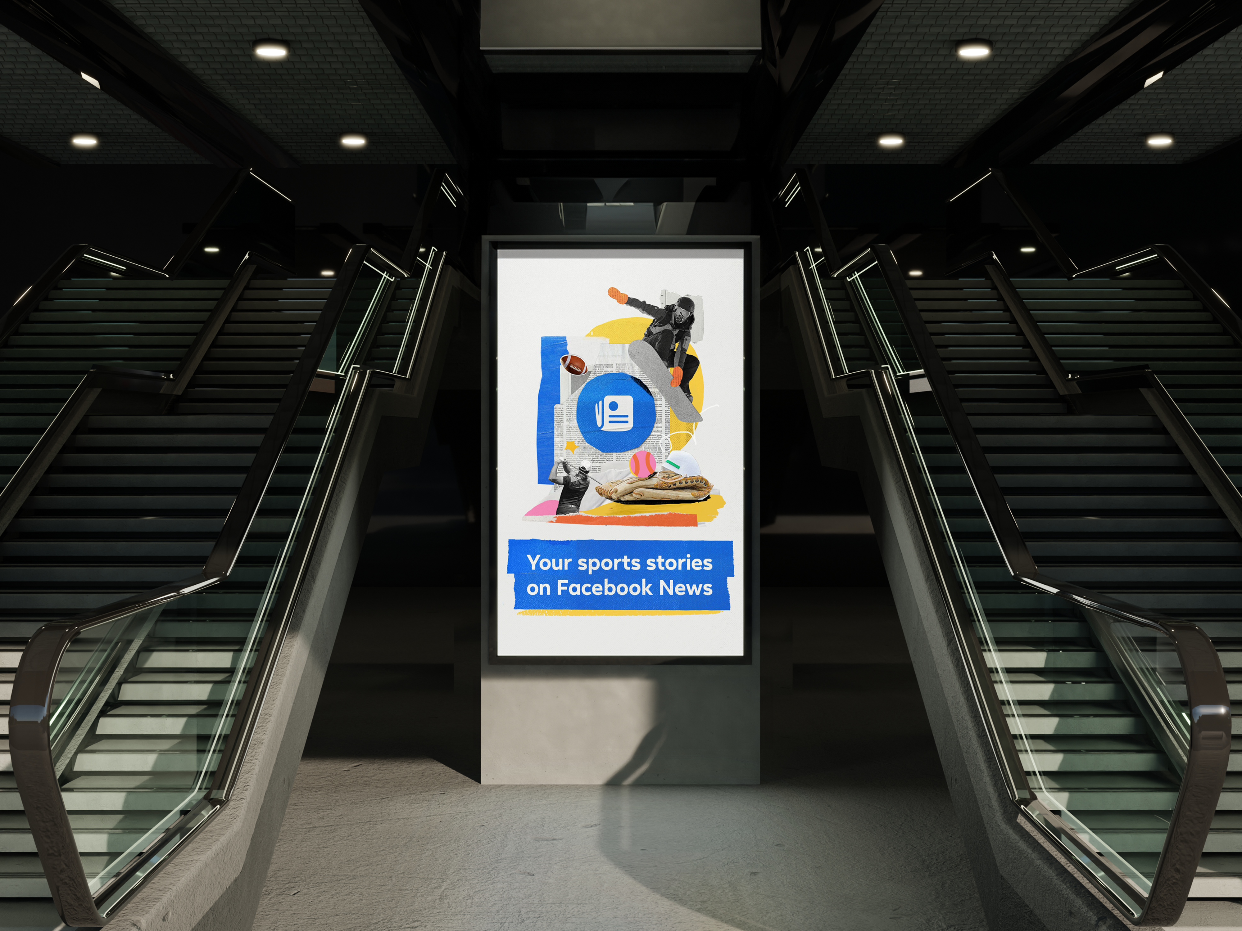
Final Looks


︎︎︎ Designing with Purpose
In the final stage, I focused on stripping away the clutter and dialing up the clarity. We pared down the color palette and made a conscious choice to use only warm tones in the imagery—so that the blue title bars would pop and never be overlooked. Every image and every color was chosen with care. The goal was to tell real stories in a way that felt fresh, familiar, and unmistakably clear.